Summary
Overview
ViddL was founded in 2017 by young people who believed that there was a need for change in the package delivery industry. They thought that with better technological infrastructure, the industry could be renewed, as there had been little innovation in this area in recent years. They started working hard and achieved the goal of delivering thousands of packages every day throughout Hungary.
ViddL contracts with large logistics companies and manages the last mile delivery of packages with the help of pedestrian/cyclist couriers. Every morning, thousands of packages arrive at the ViddL depot from the companies, and then the couriers deliver them to the addresses using a mobile application. The recipients are notified about the delivery through a multi-level system. Since they continuously optimize the package route, they are able to tell the exact arrival time of the courier.
My Responsibilities
I started working with ViddL when the courier application and their internal admin system were already done, and the delivery was already in progress. As a startup company, the initial system was an MVP with minimal functionality and a slightly clumsy appearance, but it managed to handle daily deliveries without major issues.
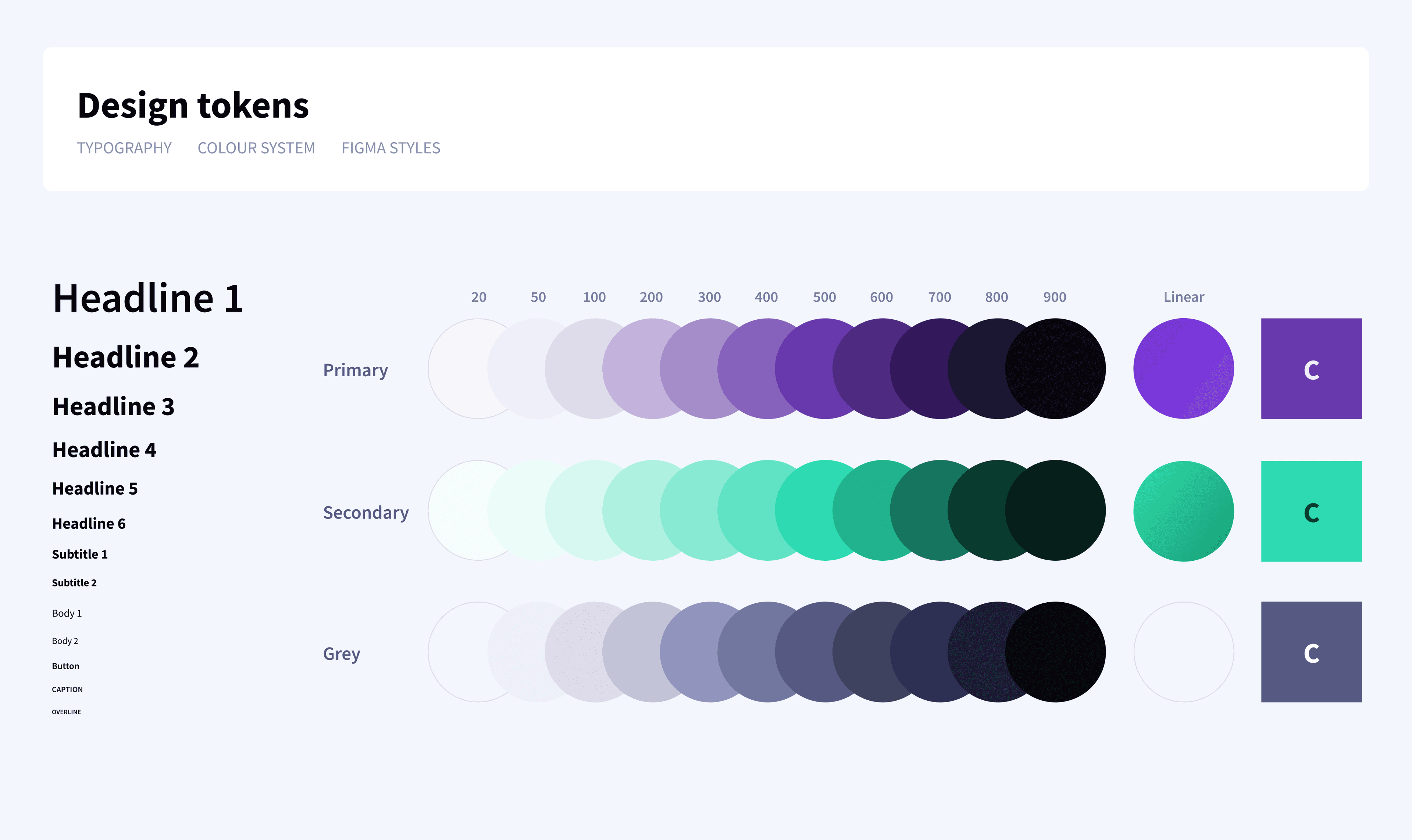
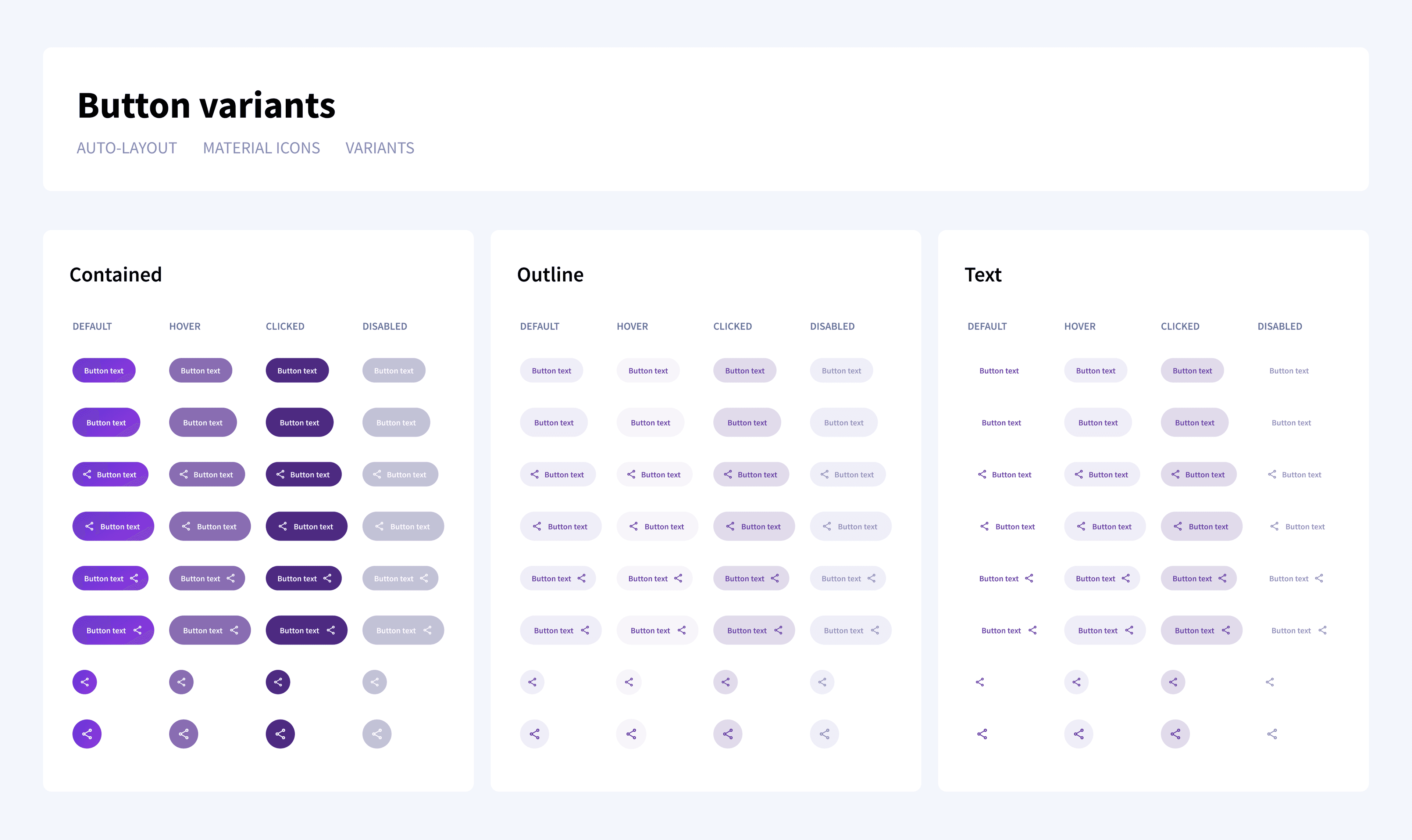
My task was to unify the appearance of the ViddL applications and create a design system that developers can easily implement. Then based on this system, I had to redesign the ViddL applications step by step to make them easier to use.
Result
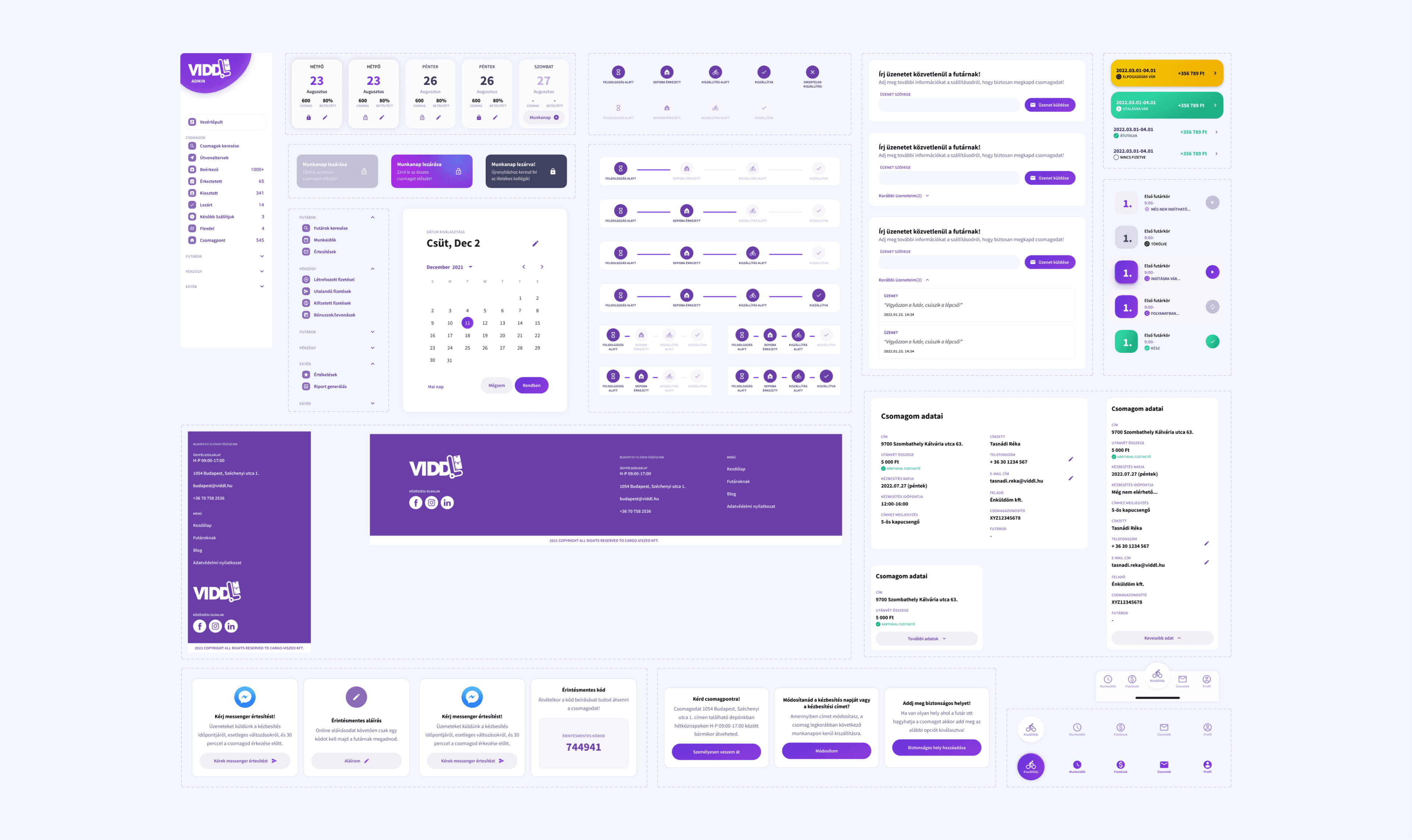
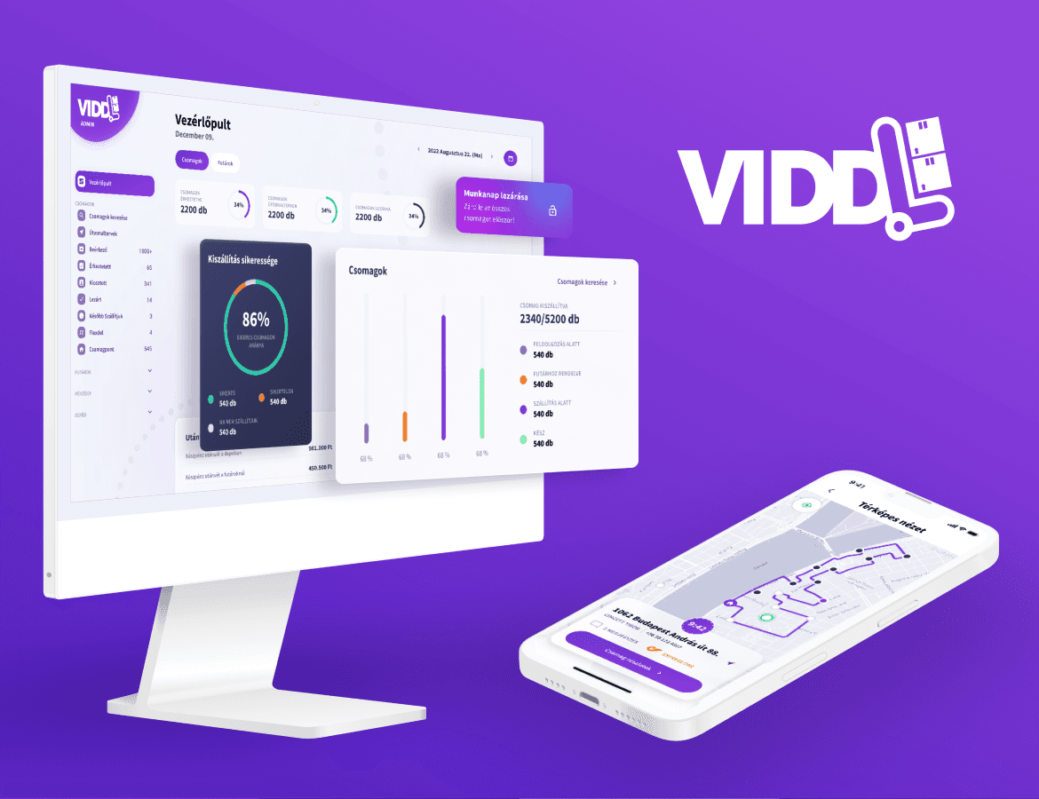
During our two-year collaboration, we managed to build a unified design system library that can be used quickly and efficiently for future developments. We completely redesigned the package tracking system, making it possible to notify recipients much more accurately about the arrival of packages.
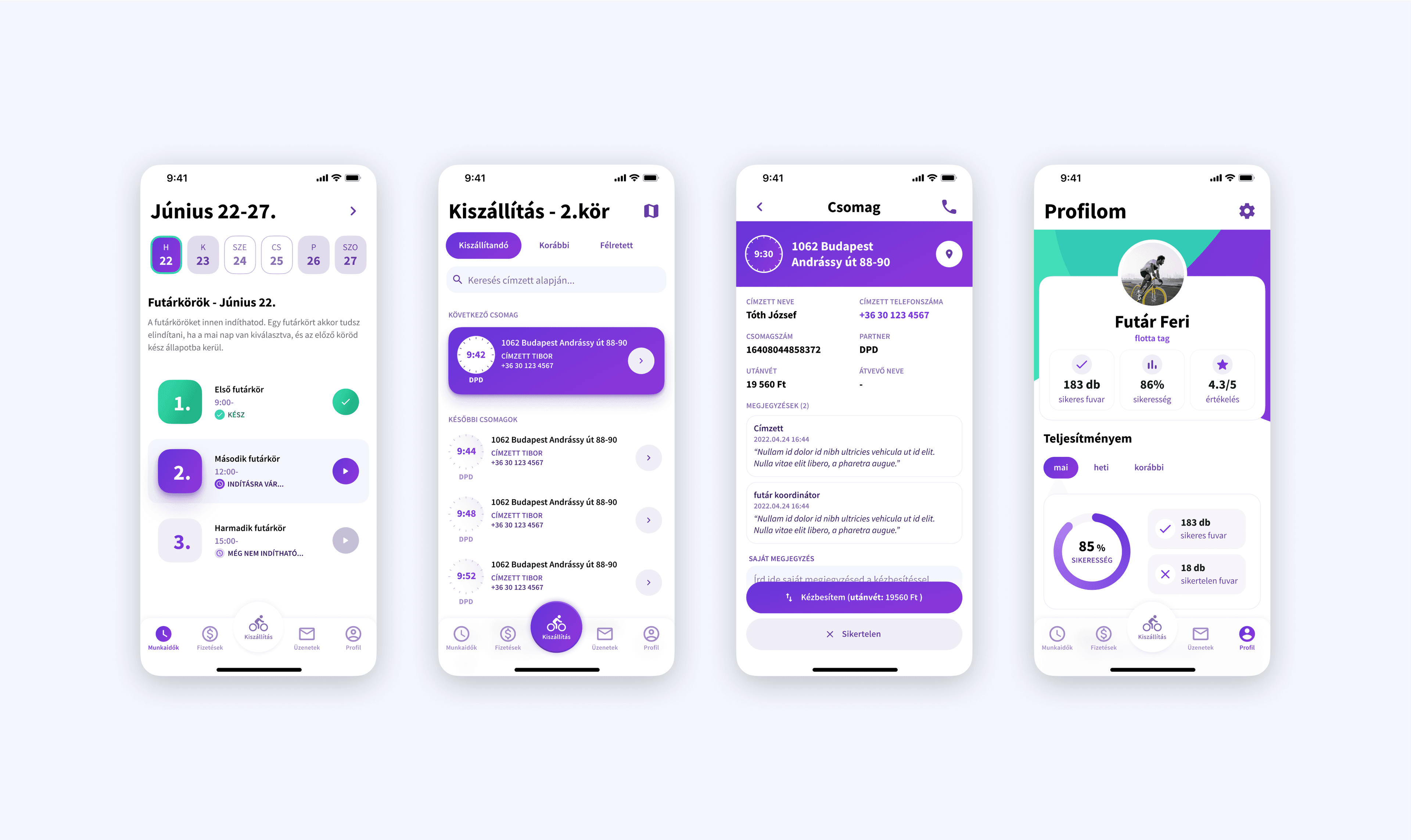
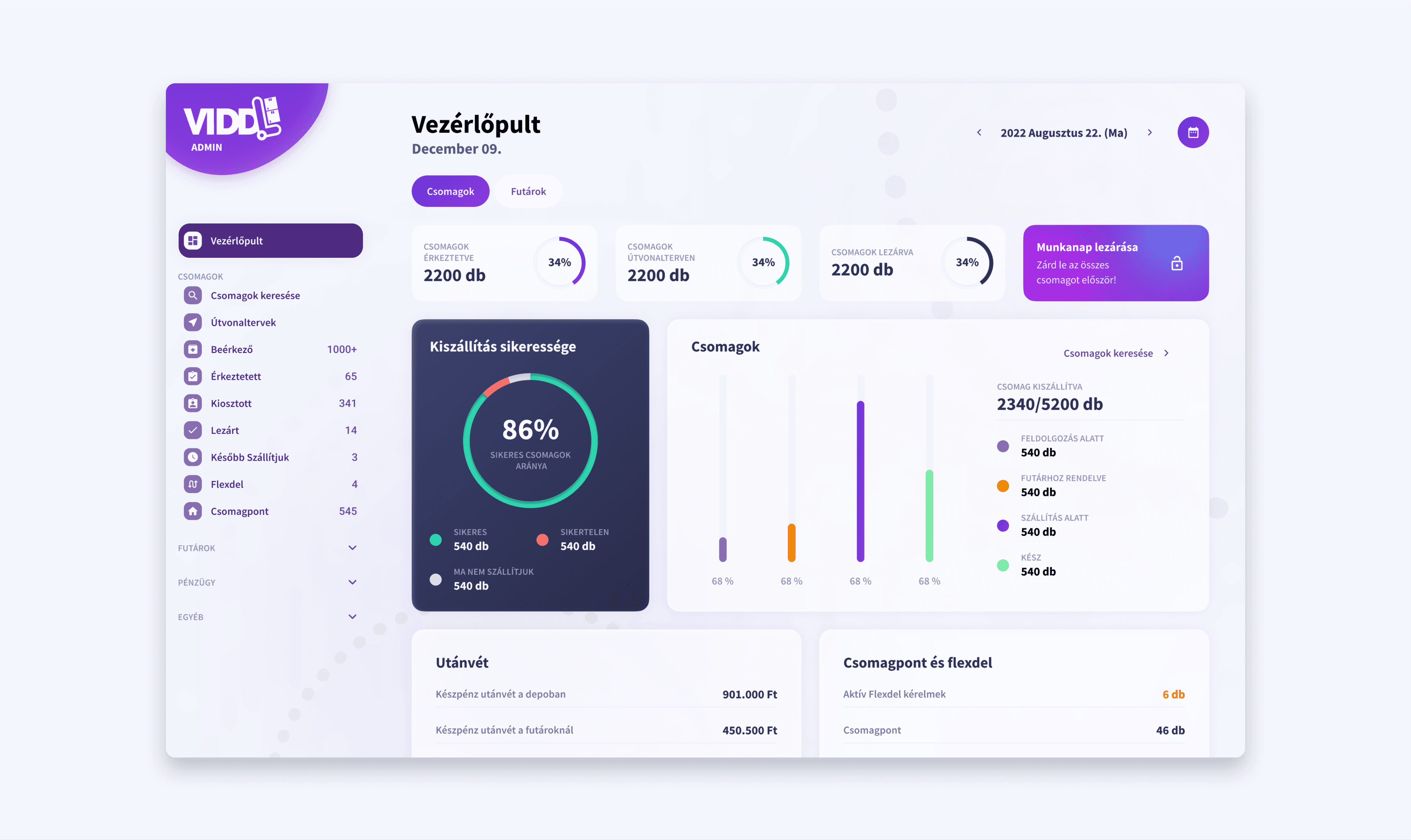
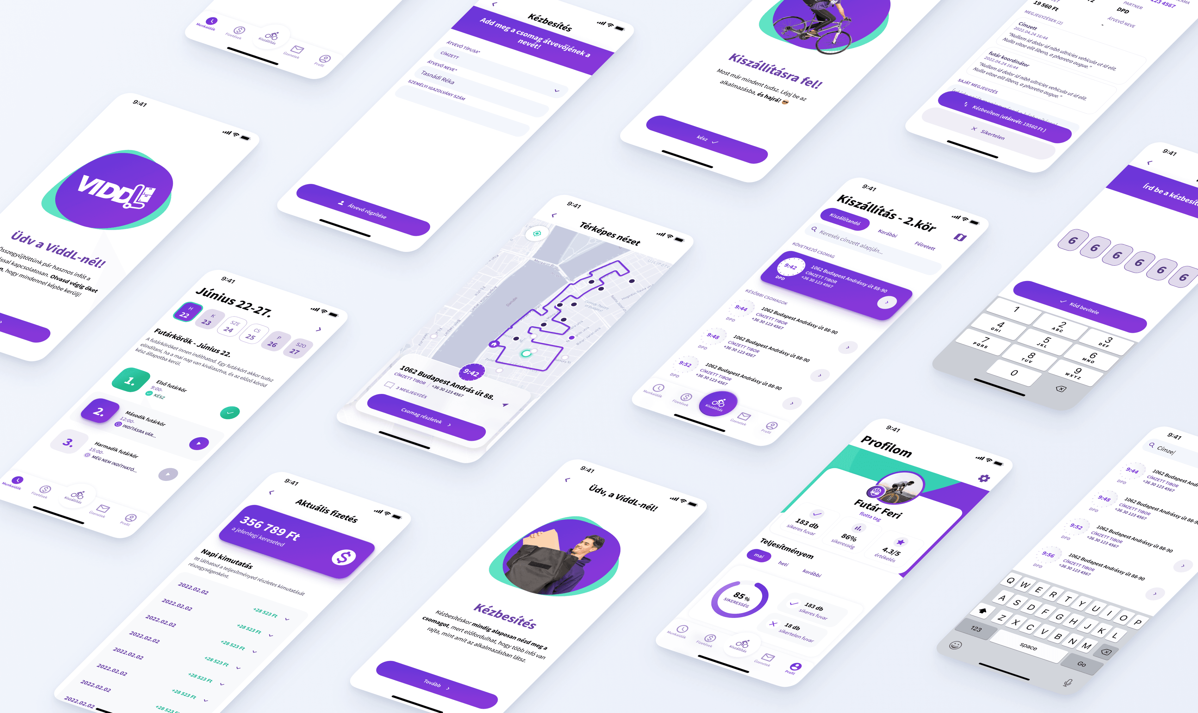
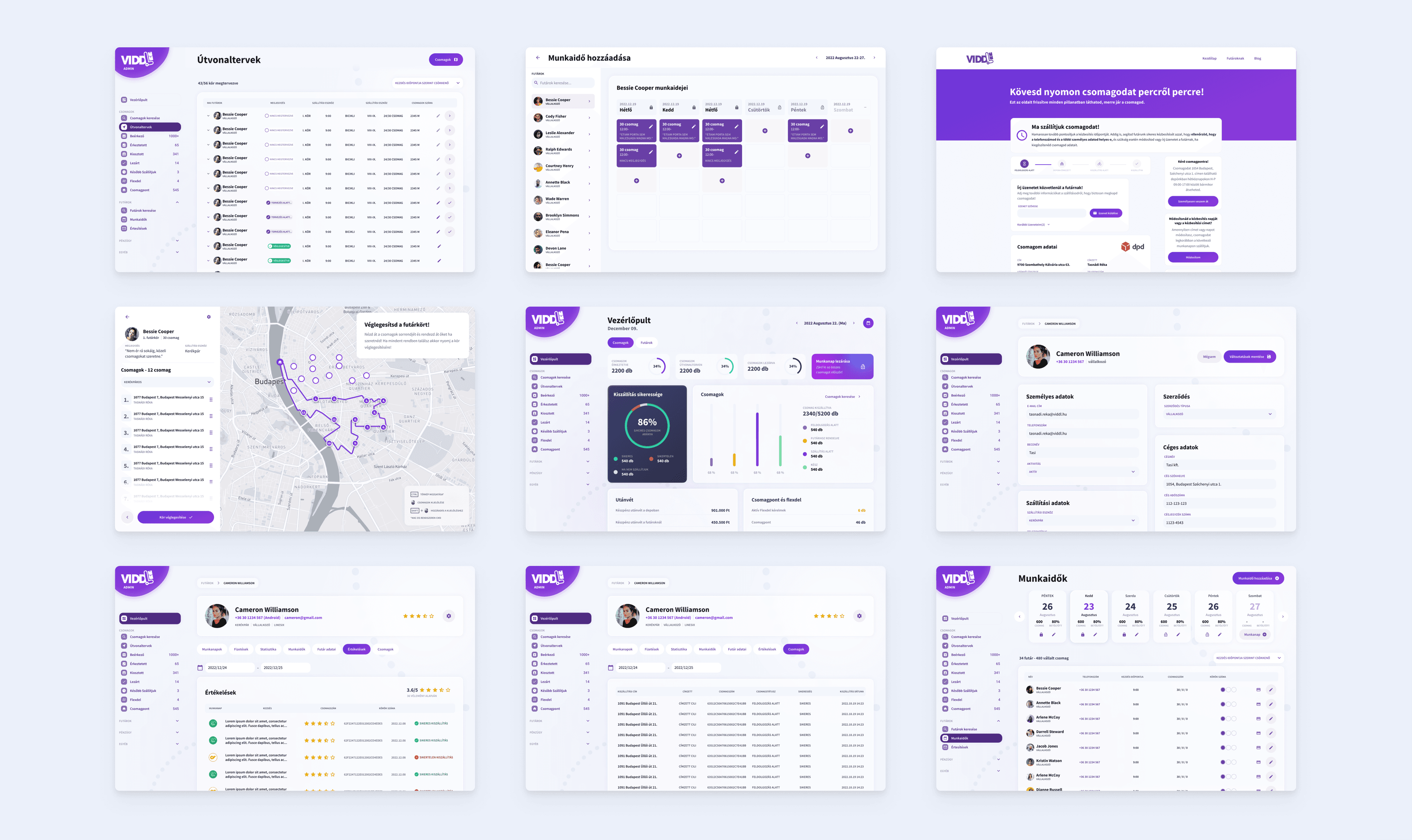
The courier mobile application also received a fully functional modern interface that better tracks the delivery process and provides simpler use for the couriers. The admin interface also received a new user-centered appearance, making it easier for courier coordinators, depot managers, and management to follow the daily delivery.
Package tracking site
Problems
One more feature, one more section.
Recipients can stay informed about the status of their incoming package through the package tracking site. Here, they can modify delivery time/address or request to have their ordered product delivered to a package pick-up point.
Whenever a new feature was introduced on the website, developers solved it by adding a new section, resulting in a rather lengthy scrollable page. Unfortunately, this had the consequence that customer service was frequently overwhelmed with inquiries about information that was available on this interface but went unnoticed by users, causing a heavy workload for the colleagues.
You can never notify too early.
ViddL sends multiple notifications to recipients regarding the delivery time of their package on the day it arrives. These emails are sent after the courier start working. As some couriers only started working later, even after lunchtime, there were several complaints that recipients received notifications too late and could not plan their day around the given time window.
Another recurring complaint related to this was that the time window given to recipients was too broad, so they couldn't plan their day accordingly.
Solutions
Defining new estimation points for accurate forecasting.
In response to feedback, I worked together with management to create a user-flow for package arrivals, which visually and clearly outlined the morning processes of ViddL depots. After creating the flow, we defined points during package processing and delivery where we could obtain additional information about the delivery time.

As a result, we were able to send out a 3-hour time slot to recipients much earlier, even in the early morning hours. As we gathered more information in advance about the delivery (such as how many packages the courier had planned, their mode of transportation) we were able to determine more accurate time slots for package arrival. We kept users informed of these interval updates until they received the final email about a 5-minute time slot.
During the project, there was a fear that the many emails would be counterproductive and annoy users, but we took the risk because of the more precise notifications. Eventually it turned out that there was no need to worry.
Above the fold
In addition to the notifications, the other problem was the overload of the customer service. As I mentioned, users often contacted them for information that was already available on the package tracking page but they couldn't find it.
Most users didn't even scroll through the page, so they had no chance of finding the necessary features or information. In addition, the most important information for the recipients - the delivery time - was in the middle of a data list, which users didn't always find.
In response to the feedback, I completely redesigned and restructured the page. I aimed to display the data as concisely and clearly as possible, so that the most important ones would catch the recipients' attention immediately after opening the page.
Results
During live testing, the workload of customer service drastically decreased from one day to the next, as significantly fewer recipients called customer service compared to before.
Internal and Google reviews also included feedback praising the continuous and accurate information provided.
More details coming soon...
For a designer making a portfolio is an everlasting task. So the documentation of this project is still in progress. Sorry for that, but I have some mockups and screenshots that I can share with you until then! :)
